Color is more than a visual experience—it’s a language, a mood, a memory, and a mirror of the world around us. It moves through our lives in ways both subtle and spectacular. Whether you’re mixing paints in a studio, choosing an outfit, or soaking in a sunset, color is a constant companion and creative force.
In art, color is one of the most fundamental tools of expression. It influences how we feel, how we interpret imagery, and how we respond to the world around us. In everyday life, it’s a part of design, branding, identity, and emotion. So how do artists work with color intentionally—and how can anyone begin to see color more clearly?
This article is your invitation to dive into the world of color: its theory, symbolism, practical use, and its power in both realism and abstraction.
1. Color Is Everywhere
Step outside and notice your surroundings. The soft green of moss. The deep charcoal of wet asphalt. The blue cast of early morning light. We tend to take color for granted until we deliberately pay attention.
In daily life:
Marketing & Branding use color psychology to evoke feelings (think red for excitement or blue for trust). Interior Design uses palettes to create mood—warm tones for coziness, cool tones for calm. Fashion uses color to express individuality, seasonal trends, or cultural identity.
As artists, we become color translators—turning the ordinary into the extraordinary.
2. The Basics of Color Theory
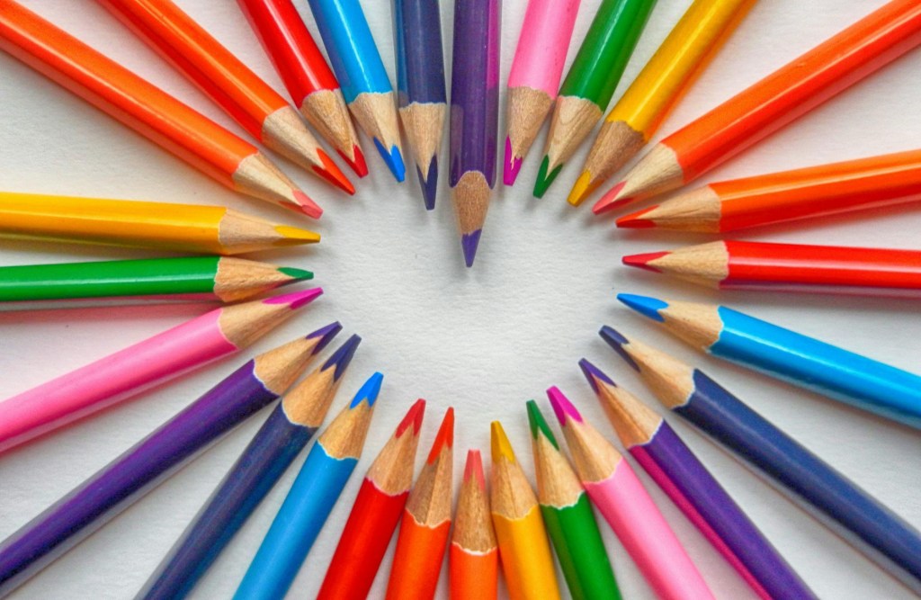
Understanding color begins with the color wheel, a foundational tool for artists and designers.
Primary Colors: Red, blue, yellow Secondary Colors: Orange, green, violet (made by mixing two primaries) Tertiary Colors: Red-orange, blue-green, etc. (mix of primary + secondary)
From the wheel we derive essential relationships:
Complementary Colors: Opposites on the wheel (red & green, blue & orange). They create high contrast and vibrancy. Analogous Colors: Neighbors on the wheel (blue, blue-green, green). They create harmony. Triadic Colors: Evenly spaced (red, yellow, blue). Balanced but bold. Monochromatic: Variations of one hue—great for mood or minimalism.
3. Color Mixing: The Art and Science
Mixing color is a skill developed over time. Whether you’re using paint, digital media, or textiles, understanding how colors interact is crucial.
Tips for Mixing Color:
Use limited palettes to avoid muddiness. Sometimes less is more. Always test mixtures before applying to a final piece. Learn how to neutralize a color (e.g., add a bit of the complement to dull brightness). Understand warm vs. cool tones: a “warm” blue leans toward green; a “cool” blue leans toward violet.
Pro Insight: Make a color chart using your materials. It’s one of the most useful exercises for any artist.
4. Color in Realism
In representational art, color serves to capture the world as we see it—or at least how we emotionally interpret it.
Observe light and shadow: shadows aren’t just “black”—they might be cool blues, soft purples, or dusky greens. Consider atmosphere: is the scene warm and golden, or cold and gray? Colors help build this narrative. Skin tones are never just peach. They reflect everything—light, surroundings, emotion.
Realistic color is as much about perception as it is accuracy.
5. Color in Abstract Art
In abstract work, color becomes the main character—free from the obligation to mimic reality.
Use bold contrasts to evoke energy or tension. Try monochrome series to explore mood variations. Use symbolic colors to express personal or cultural meanings.
Color in abstraction lets you play with emotion, rhythm, and concept. There are no rules—only relationships.
6. Emotional and Cultural Dimensions of Color
Color evokes feeling, but it also carries history and symbolism that varies across cultures.
For example:
Red: Passion, danger, celebration, or luck (especially in Chinese culture) Blue: Calm, sadness, spirituality Yellow: Joy, caution, wealth, or mourning (in some Eastern cultures) Black: Elegance or death; authority or rebellion
Ask yourself: What does a color mean to you? To your audience?
7. Using Color with Intention
Whether you’re choosing a palette for a painting or designing a brand logo, intention matters.
Strategies to try:
Mood Boards: Collect images and color samples that evoke a particular feeling or theme. Palette Generators: Try tools like Coolors or Adobe Color for quick harmony. Nature Study: Mother Nature is the best colorist. Study sunsets, stones, or flowers for combinations that just work. Limit Your Palette: Challenge yourself to create with 2–4 colors for creative constraints.
Color isn’t just for beauty—it’s a tool of storytelling.
8. The Psychology of Color in Art Therapy
Color plays a significant role in art therapy and emotional healing.
Warm colors (red, orange, yellow) tend to energize and stimulate. Cool colors (blue, green, violet) tend to calm and soothe. Choosing and working with colors can help people express what words cannot—grief, hope, fear, transformation.
In healing work, color becomes a bridge between the inner and outer world.
9. Keep a Color Journal
Artists often keep sketchbooks—but what about a color journal?
In it, you can:
Document color combos you love Track how your palette changes over time Record color meanings that resonate with your work Play with mixing recipes and pigment experiments
It becomes a personal visual archive and creative lab.
10. Final Thoughts: Color Is a Lifelong Conversation
As artists—and as humans—we’re in a lifelong relationship with color. It reflects our culture, our personality, and our evolving perspective. Whether you’re painting realism, crafting bold abstracts, or simply noticing the hues in your daily life, color is always inviting you to look again, feel more deeply, and create with greater intention.
So take a moment today—look out your window, open a sketchbook, pull out your paints—and ask yourself:
What color is the moment? And how will I tell its story?
